Level Up!
MOBILE / WEB
Empowering educators to teach financial literacy to 11 - 18 year olds through a simulation game.
TIMELINE
October - November 2021 (1 month)
SCOPE OF WORK
User research, wireframing, prototyping, usability testing, 3D modelling
TEAM
1 x UX/UI Designer (me) - part of Google UX Course
PROBLEM
Students do not have comprehensive lessons in financial literacy in schools, despite a demand for it to be taught formally. Teachers do not feel confident teaching it and the onus is left to the parents to teach children, which results in widely varied standards in financial literacy understanding.
IMPACT
66% of teachers said they'd convince their school to try out the service if it was developed.
100% of those tested believe the app would be 'extremely' useful in improving students' financial literacy.
100% of those tested believe the app would be 'extremely' useful in improving students' financial literacy.
PROBLEM
Formal education fails to teach students basic lessons about money
From LIBF's Young Persons' Money Index survey, we find that:
1/3
of children surveyed had not received financial education
75%
said most of their financial education comes from their parents
8%
cited school as their main source of financial education
83%
wanted to learn more about money and finance in school
There is a strong correlation between those with poor financial literacy and those coming from lower income background. An accessible financial literacy education could be key in tackling social inequality, and this project could help play a role in that.
COMPETITIVE ANALYSIS + THE GAP
Existing apps put the onus on children and parents.
As well as white paper research, I analysed the existing apps on offer that teach financial literacy to children. Existing financial literacy apps mainly fell under two categories:
Bank simulation apps
- Parents gift children money for completing chores.
- Children familiarise themselves with banking and saving.
Mini lessons and quizzes
- Children teach themselves in return for points or badges.
Bank simulation apps
- Parents gift children money for completing chores.
- Children familiarise themselves with banking and saving.
Mini lessons and quizzes
- Children teach themselves in return for points or badges.
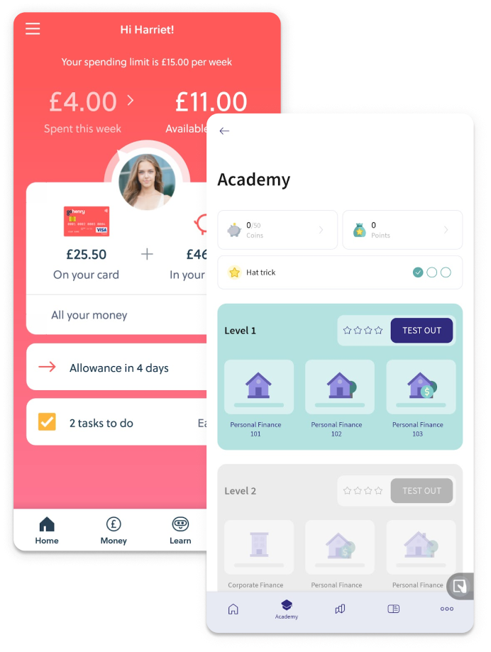
The nature of the apps corroborated the white paper research that students get most of their financial understanding from their family.
However, not all parents or guardians have the time, means, confidence or desire to teach their kids financial lessons. Providing education in class would make financial literacy more accessible to those who don't have the opportunity to learn about it at home.
However, not all parents or guardians have the time, means, confidence or desire to teach their kids financial lessons. Providing education in class would make financial literacy more accessible to those who don't have the opportunity to learn about it at home.
PRIMARY RESEARCH
"Money is vital to learn about, but it's boring and we don't have time to learn about it."
From 28 survey responses from teachers and 12 survey responses from students both from a wide range of countries, and 3 interviews with teachers and students, I learned the following:
Only an average understanding of financial literacy
On a scale of 0-5 (0 = no understanding and 5 = strong understanding), students ranked their financial literacy understands at 2.89 and teachers at 3.1.
Finance is not the most interesting subject
Students felt that learning about money is "difficult to be excited about".
A vital subject for schools to teach
Nonetheless, 93% of students and teachers felt that it is very important for schools to teach financial literacy.
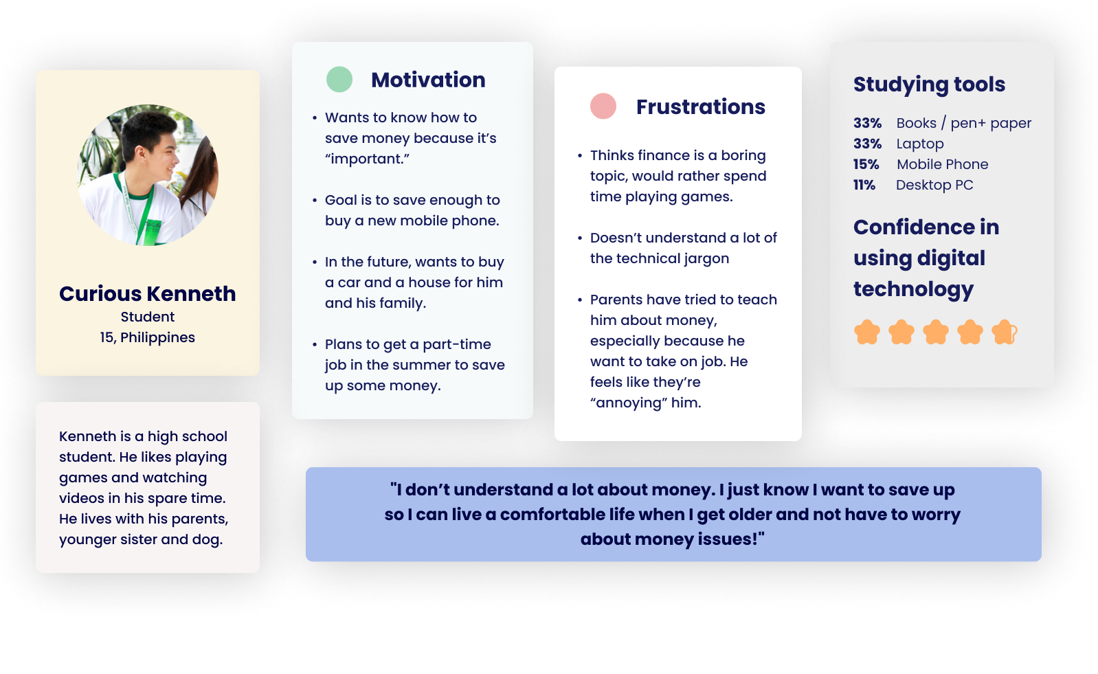
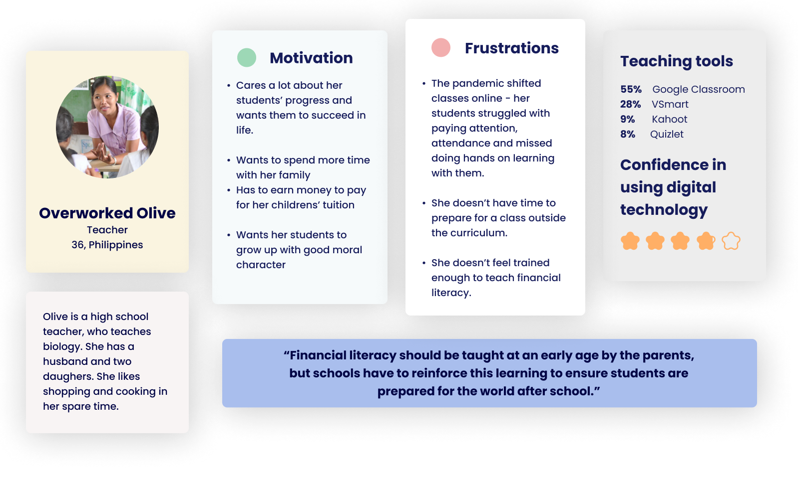
Based on my primary and secondary research, I crafted two personas to help focus the design of the app.
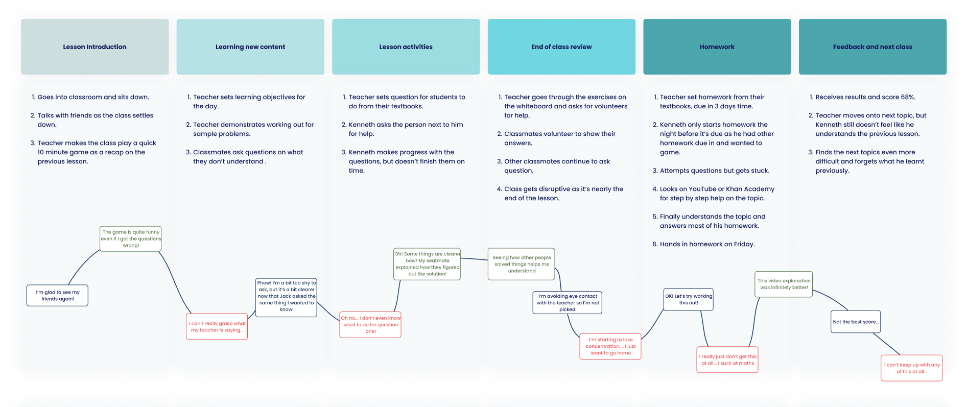
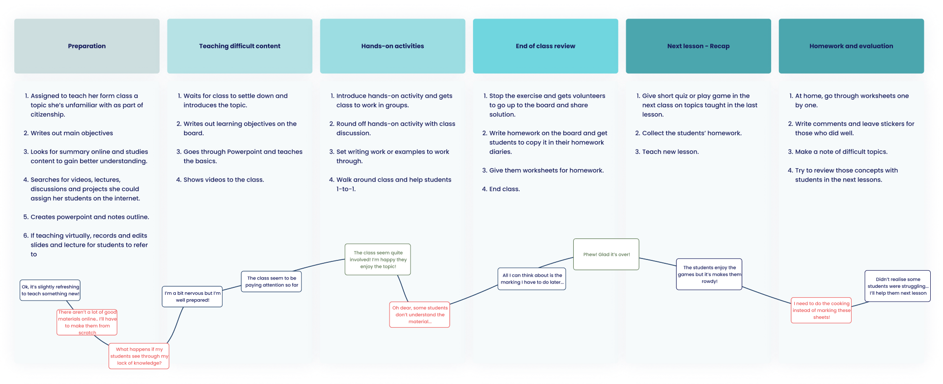
JOURNEY MAPPING
Mapping emotions
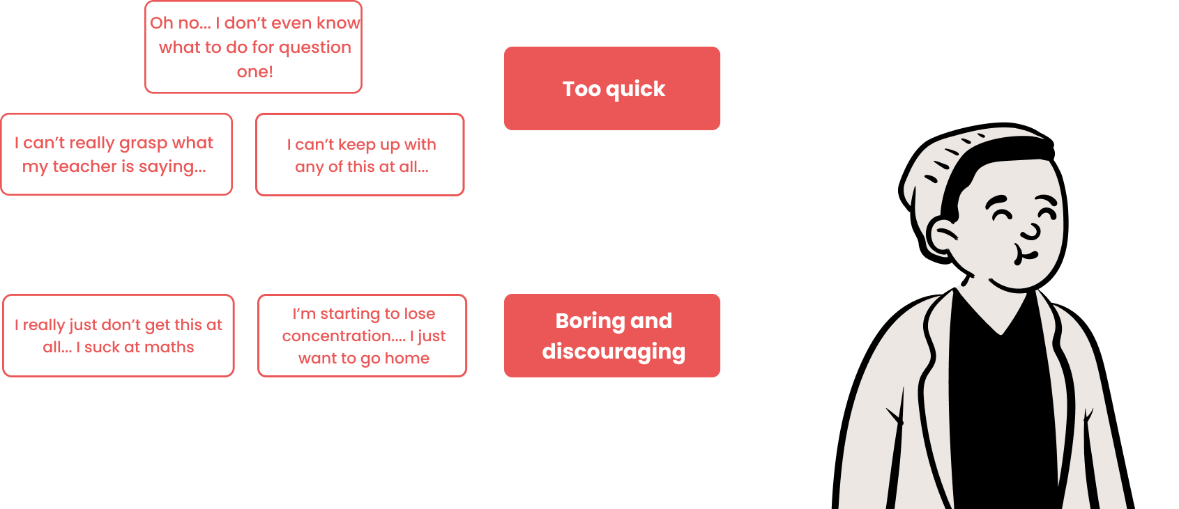
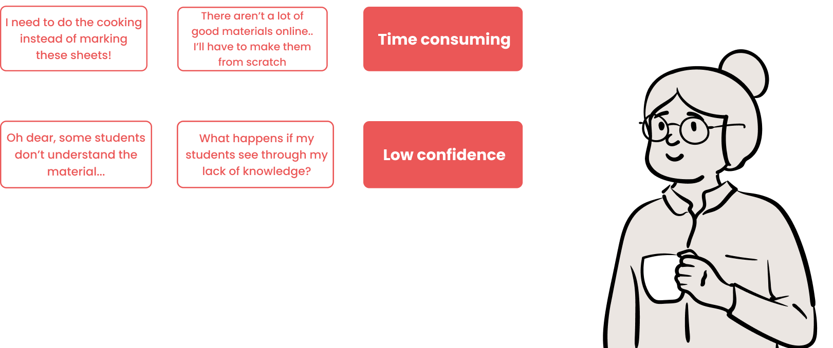
Journey mapping was useful to knuckle down at what point exactly do Kenneth and Olive's pain points occur (and therefore the opportunities where the app could alleviate these issues).
What does Kenneth feel?
What does Olive feel?

DEFINING THE PROBLEM
After getting to know the target users and their pain points, these problem statements helped to focus the upcoming ideation phase.
Kenneth is a high school student and enthusiastic gamer who needs an engaging, easy-to-understand way to reinforce financial lessons because he wants to know how to manage his money in the future.
Olive is a busy high school teacher and mother of two who needs access to ready-to-go resources to teach financial literacy because she doesn’t want to spend too much time preparing lessons and marking.
CONSTRAINTS AND ASSUMPTIONS
Constraints
- Flexibility - Create a general platform for the lessons to be held, but don't create advanced one-off features for the game that are lesson-specific for the MVP (eg. stock market simulator)
Assumptions
- A few of the initial lessons can be conducted in class as part of PSCHE/Citizenship by a teacher to start the children off.
- Students have access to a smart phone or computer with internet access.
- School will allow homework to be set for financial literacy, even if it's taught as part of PSCHE/Citizenship.
- Students have access to a smart phone or computer with internet access.
- School will allow homework to be set for financial literacy, even if it's taught as part of PSCHE/Citizenship.
IDEATION
How can students learn about financial literacy in an engaging way?
Both Kenneth and Olive have their own distinct pain points, so how could we alleviate them? Using How Might We statements and Crazy Eights, I conceptualised different features that could be included in the app to try to alleviate these pain points.
.png)
How might we gamify teaching of financial literacy?
How can teachers reduce the time spent preparing for lessons?
How might we help teachers cut down on time spent preparing for lessons?
.png)
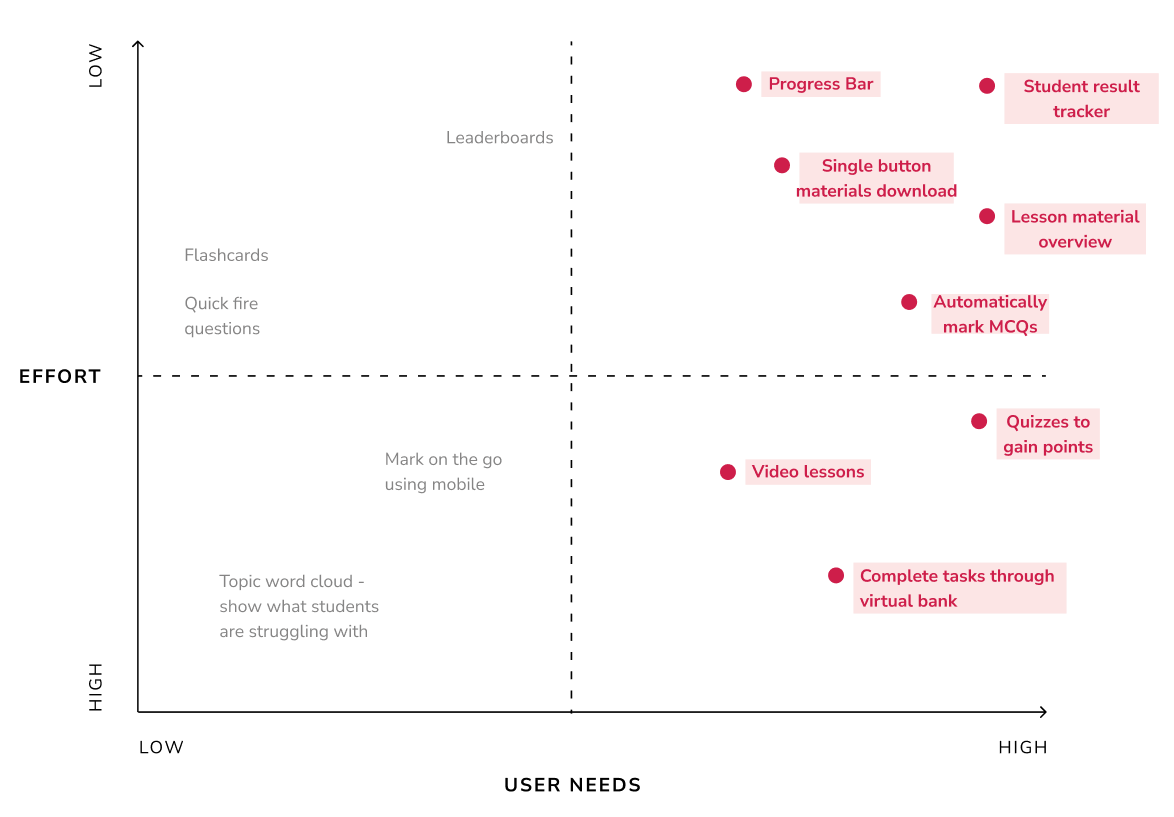
FEATURE PRIORITISATION
Which features should take priority?
Mapping features across needs and effort to decide which features should make up the MVP for Olive and Kenneth to achieve their goals.
IDEATION
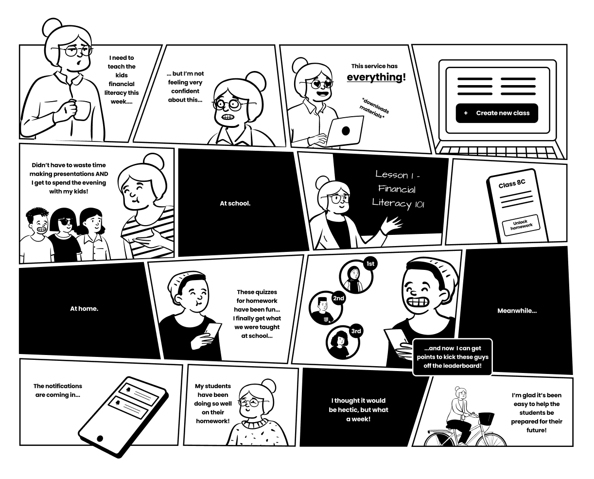
How could an app be used to reinforce lessons taught in the classroom?
Before figuring out specific features that could be included in the app, I took a step back to look at how Olive and Kenneth would use the app in context through a storyboard. This helped me figure out an initial flow between lessons taught in class and lessons taught in the app.
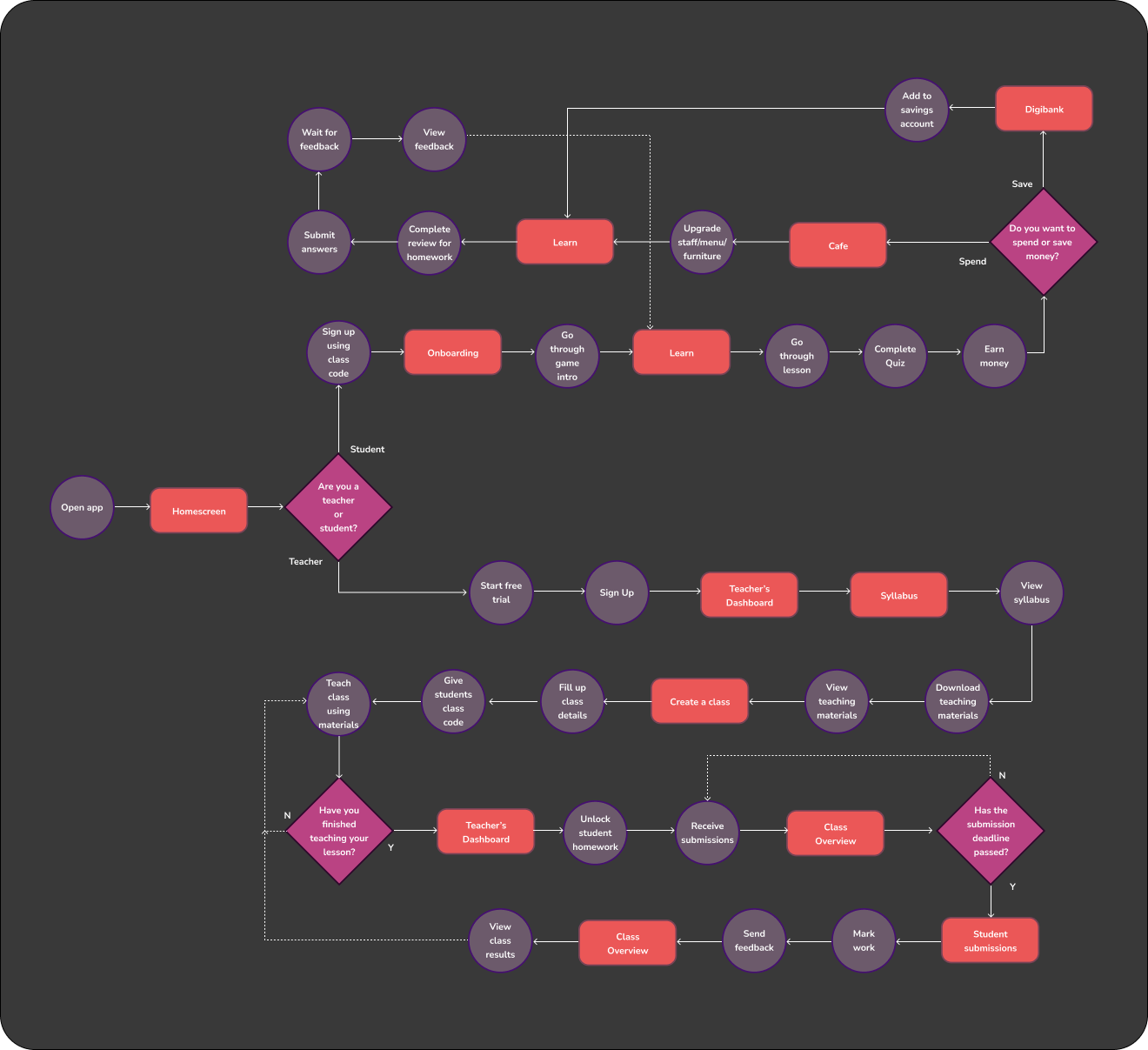
I took this flow and tried to create a more detailed user-flow diagram to determine the key screens needed and to start thinking about the key flows I needed to develop.
PROTOTYPING + TESTING
Developing a mid-fi design for a usability study
Armed with a sitemap and a multitude of ideas generated, I created mid-fi wireframes to be used for a usability study. I decided to go for mid-frame wireframes so that it would be easier to understand for teens and older participants of the study, in order to get valuable feedback for the next iteration.

IMPROVING AND ITERATING
A change of direction and improvements
I conducted a moderated usability study with 6 participants (3 teachers and 3 students) who had a series of tasks to carry out. I also carried out a short interview with them afterwards to get their opinions on what went well and what could be improved on. The following illustrates the main insights and the subsequent improvements made:
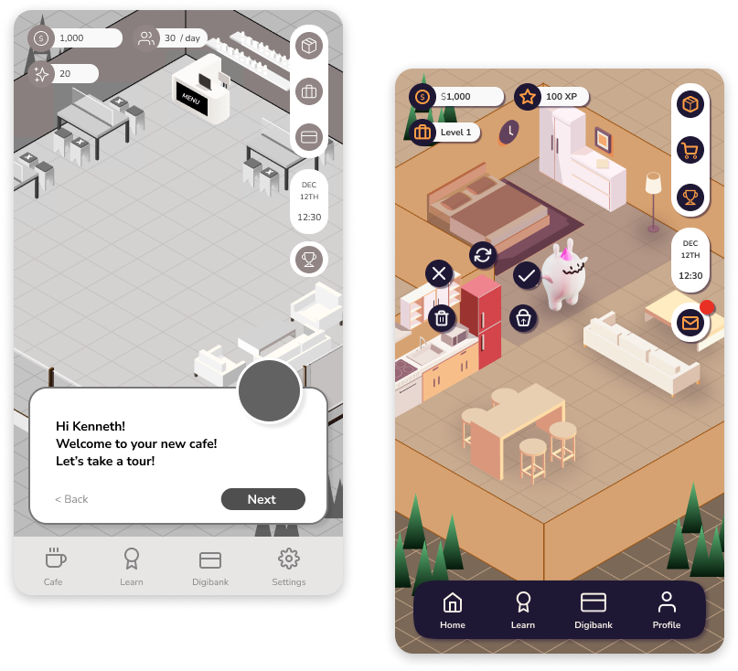
The focus of the game pivoted to personal finance from business finance
The initial premise of the game was that students would learn concept through running a cafe, based on existing exercises teachers conduct from the survey responses.
Financial literacy has to be relatable to the students. While there are a lot of lessons to learn from running a cafe business, running a business may not necessarily be on the cards for all of them.
Learning how to save for a house or a car rather than learning how to keep a business afloat would be more appropriate and engaging for those students who find the topic of money boring.
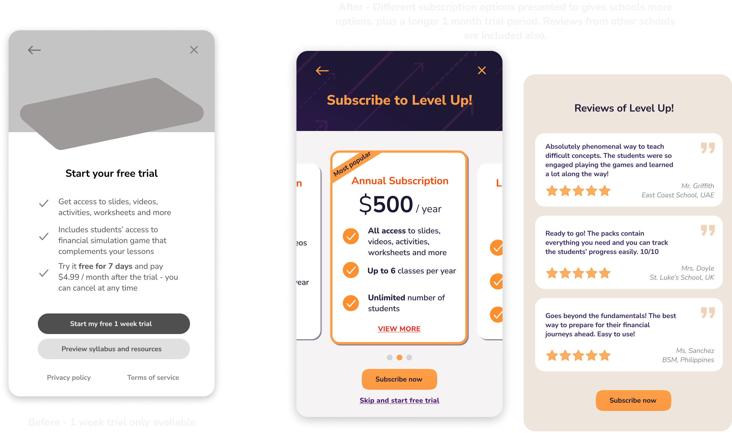
Present the service to be more appealing for teachers to subscribe to
Teachers expressed that the most convincing way to convince teachers to purchase materials is through word of mouth from fellow teachers.
Teaching services typically have different subscription options, and users expressed they’d like to see this before the free trial starts.
Lastly, the free trial should be extended to a longer period of 1 month. As the time is more generous, I would limit access to material downloads to the first topic only.
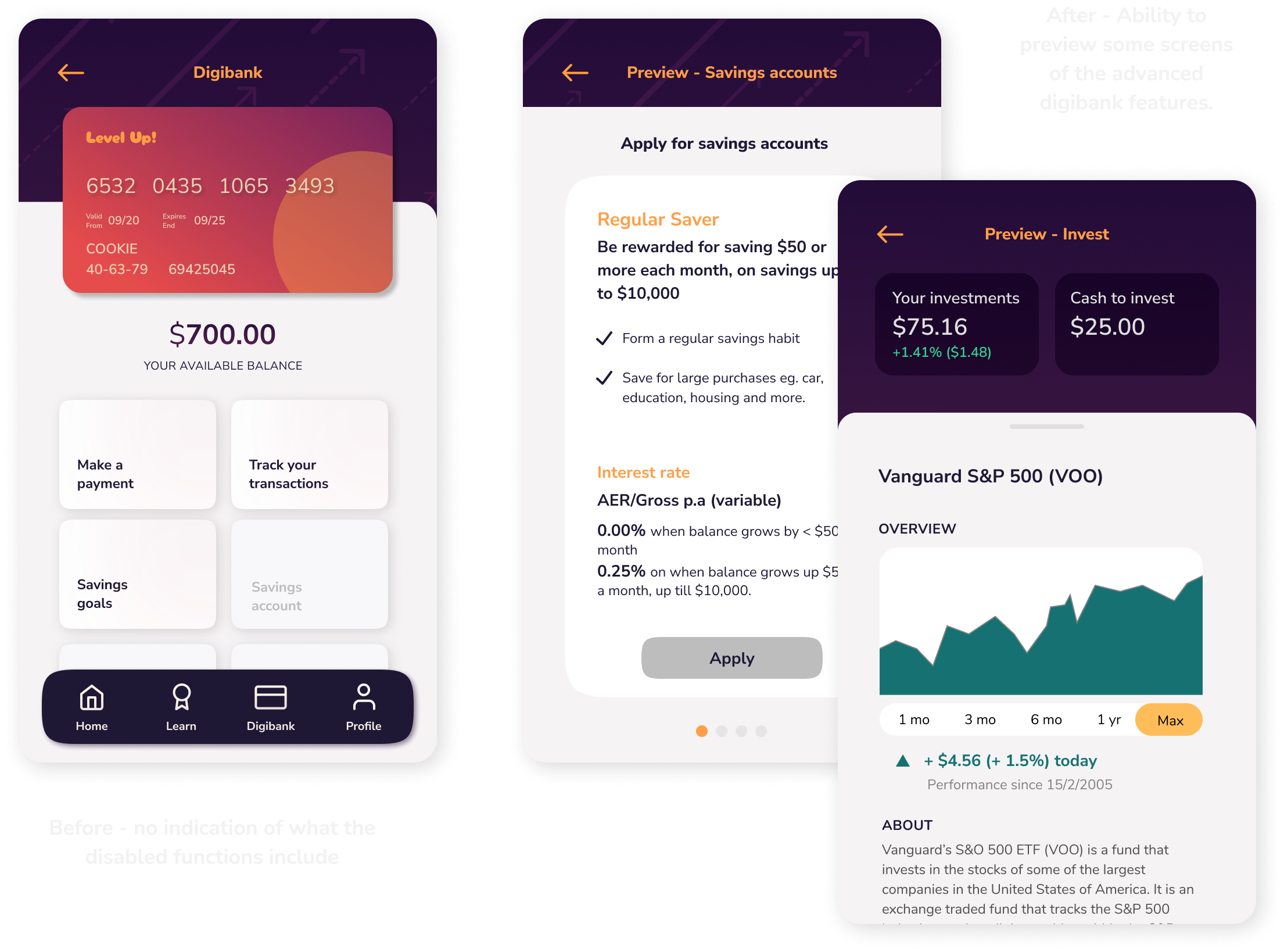
Show a preview of the features that will be unlocked later on in the game
Show a preview of the features that will be unlocked later on in the game.
Currently, there is no indication of what these features will look like - teachers stated they want a preview of the features on the students’ app that complement the theory that will be taught later into the course.
Currently, there is no indication of what these features will look like - teachers stated they want a preview of the features on the students’ app that complement the theory that will be taught later into the course.
SOLUTION
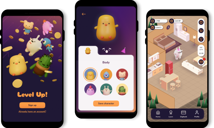
Level Up! is a virtual, immersive financial literacy game to complement in-class lessons.
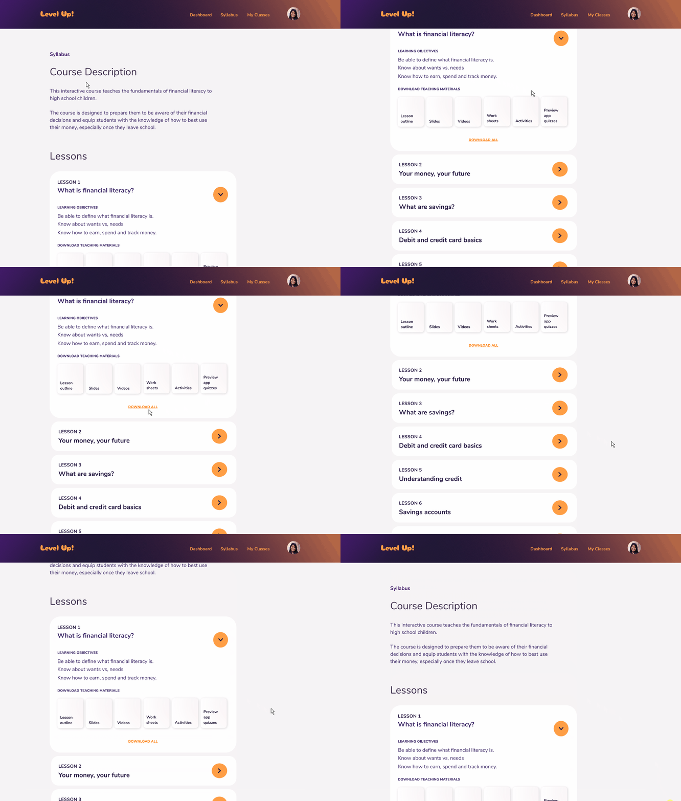
Teachers gain access to a comprehensive teaching materials pack and analytics
- Cuts down preparation time for classes.
- More time can be spent learning about financial literacy themselves to feel confident teaching it.
- Automatically collect student data on academic progress and streamlines marking.
- More time can be spent learning about financial literacy themselves to feel confident teaching it.
- Automatically collect student data on academic progress and streamlines marking.
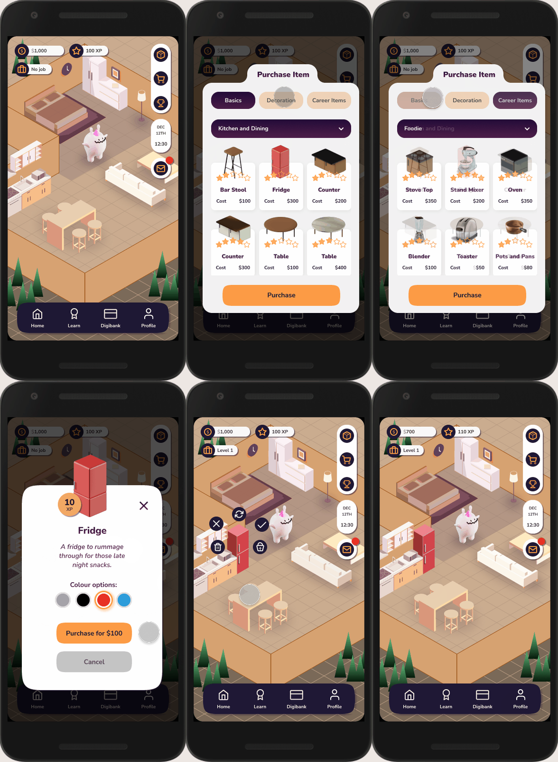
A complementary student app reinforces teachings through a life simulation game
- Students create characters with unique aspiration and life goals, which form the basis of an immersive, educational game filled with tasks to teach kids how to handle their money.
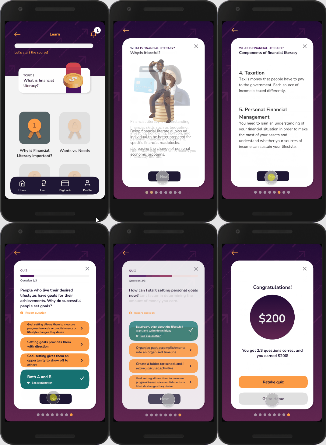
Bitesize lessons and quizzes make financial literacy easier to understand
- Bitesize lessons and quizzes (complementary to the lessons taught by the teacher) reward characters with in-game money and XP.
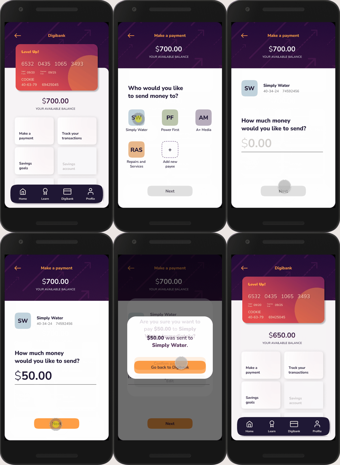
A virtual digibank
- Certain tasks in the game need to be completed through a virtual bank.
- Teaches students about making transactions, savings accounts, budgeting and more.
- Teaches students about making transactions, savings accounts, budgeting and more.
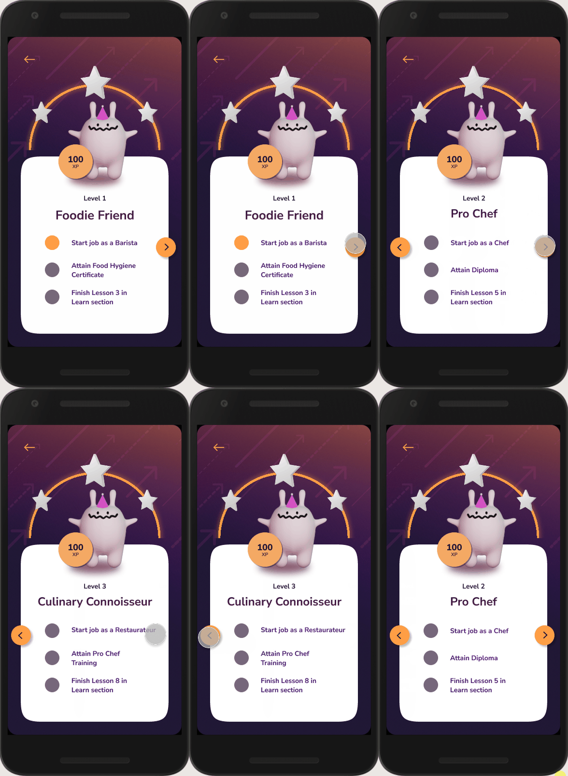
Applying taught theories to practice
- Advanced features are unlocked by the teacher after the theory is taught in class.
- This earns in-game money and XP, helping characters reach their aspirations to 'level up'.
- This earns in-game money and XP, helping characters reach their aspirations to 'level up'.
DESIGN SYSTEM
Crafting a design system
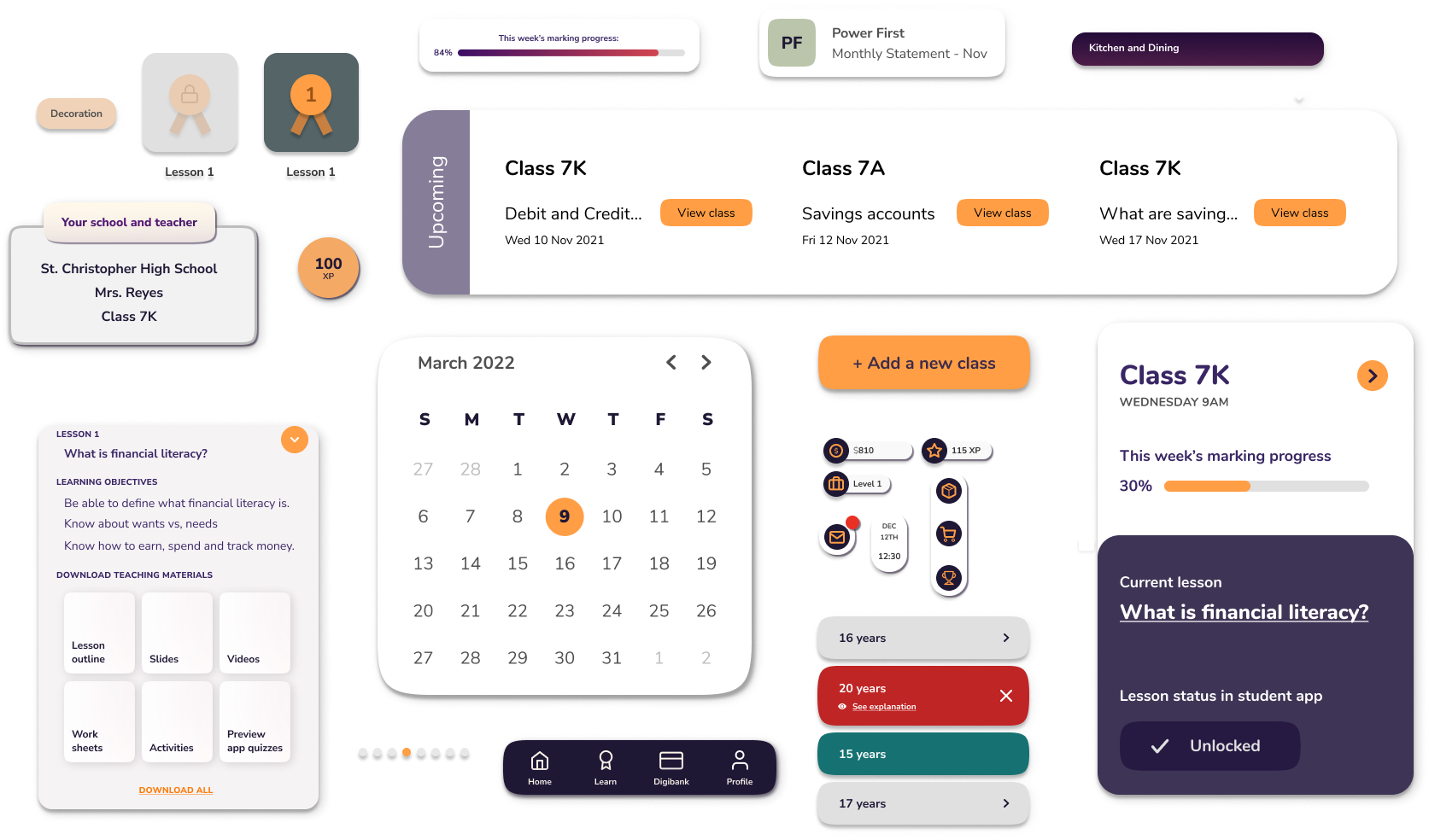
With a design that has a large scope, it was important to make the design as consistent and coherent as possible, which I did through creating a design system.
Typography
The overall design of the app follows rounded corners to reflect a more welcoming, casual and friendly tone compared to traditional banking apps for example, so the selected fonts also had to reflect this choice.

Colours
Purple is the dominant colour of the app, as a gender neutral colour (mix of blue + pink) associated with gaming (Twitch/Amazon Prime Gaming, GameCube)

Components
Components were repeated throughout the app for speed of design + to maintain consistency. It also allows for flexibility in editing should there be a change of style in the future.
Characters
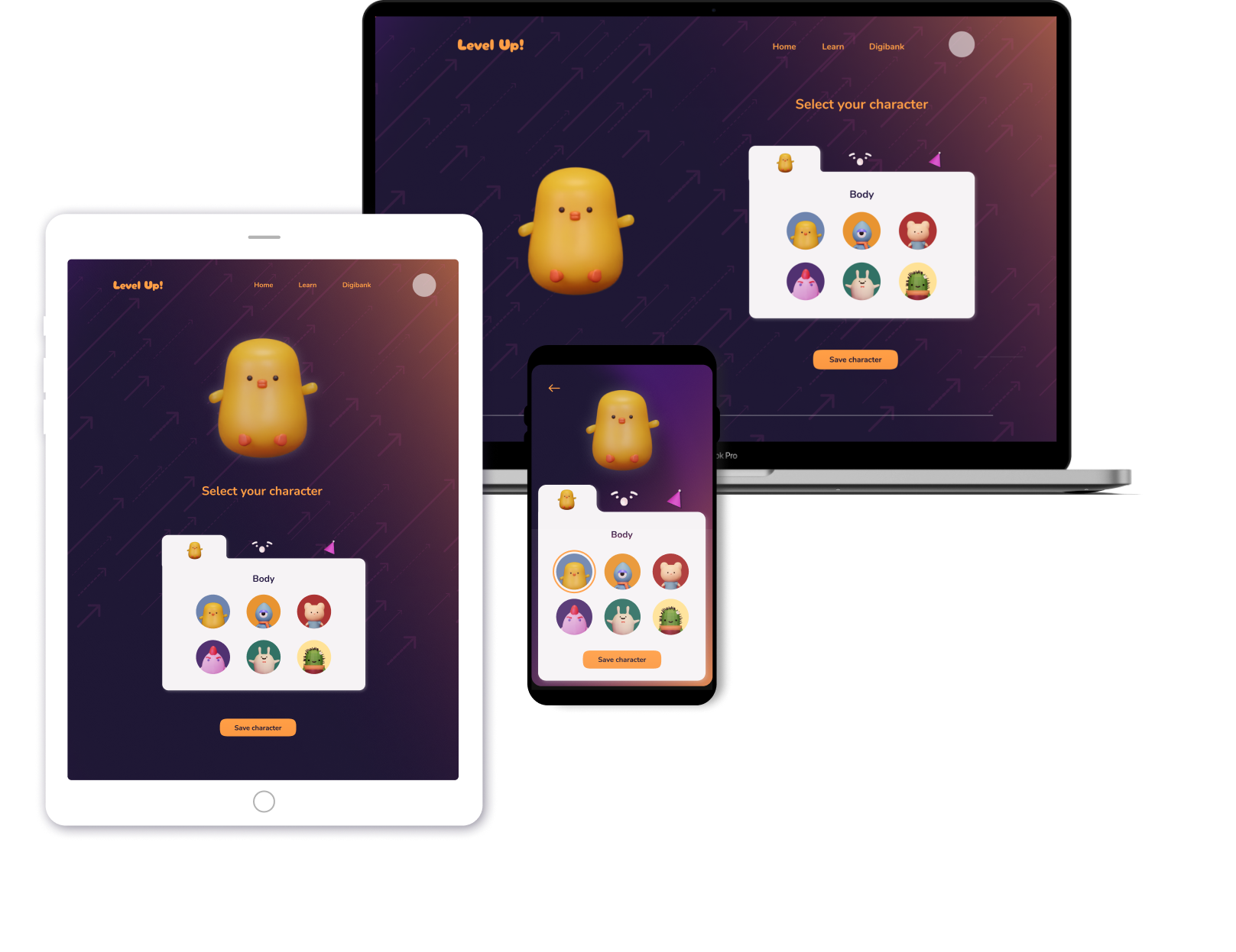
I modelled 6 characters with different personalities, expressions and accessories in order for the students to personalise them.

Responsive Design
In order to be more inclusive, I wanted to design the app as something responsive in order for it to work on a number of devices, especially in the case of some students not having access to smartphones.
IMPACT
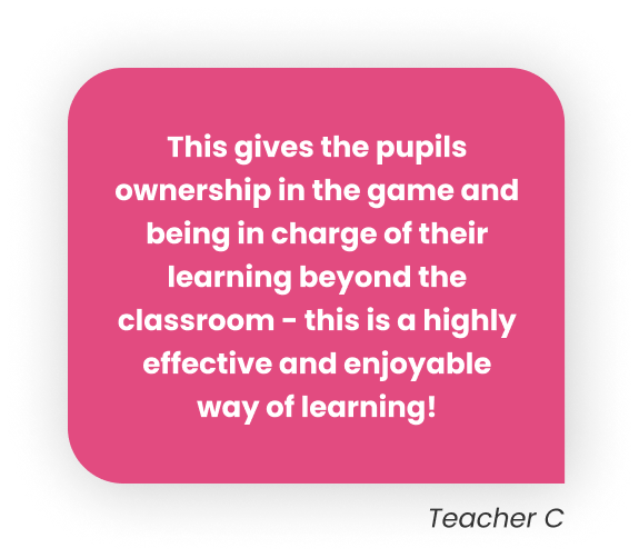
“This lets pupils be in charge of their own learning beyond the classroom.”
With the final high fidelity prototype, I conducted a last round of usability testing in a similar format to the mid-fi prototype usability test. The key results were:
01

100% of those tested believed the app would be "extremely useful" in improving students' financial literacy.
02
66% of teachers said they'd convince their school to try out the service if it was developed.
03

75% of the students said they'd be willing to spend more time learning by using the app compared to traditional homework worksheets.
If the app was developed, we could further measure its success through KPIs such as task success rate, user retention rates after in class lessons have finished and NPS.
Learnings
Pivot if it's highly beneficial for the user in the long run
Even if it seems to be a lot of effort to change designs I spent some effort on earlier on in the design process, if it benefits the user and the product in the long run, it will be effort well spent.
Test early
I could have avoided some problems with the concept of the game if I had tested a lo-fi wireframe early instead of working on a mid-fi prototype first. Even in lo-fidelity, there will still be valuable feedback.
Reduce scope
My goal for this project was to be quite ambitious and explore a range of topics to learn more about how to design for them (gaming, educational + financial), and I tried to incorporate the needs of both the students and the teachers. However, in hindsight I think it would be better to reduce the scope of the project in order to dive in deeper into the intricacies of designing for each genre and each type of user.
Future steps
Develop game mechanics in depth
As I only had 1 month to work on this project, I did not dive in deep to the game mechanics. A lot could be tweaked such as surprise event cards and the advanced bank features such as the stock market. I'd imagine there would be progressive feature released that would be developed in depth by their own teams.
Iterate based on success metrics
There will be a lot of learning and improvements to make if the service was developed and tested in depth. Some metrics to look out for are the conversion rate of those going from free trials to signing up for the service, NPS, students' progress over time and student engagement with lessons and the game beyond the minimum required by their teachers.