Community Companion
IN-HOUSE TOOL / SOFTWARE
Helping architects automatically generate masterplans and create data-driven design decisions.
TIMELINE
August - September 2021 (1 month)
SCOPE OF WORK
User research, wireframing, prototyping, user testing and illustration
TEAM
1 x UX/UI Designer (me) - part of Google UX Course
PROBLEM
An housing startup is looking to scale up their product offerings from single homes to large scale mass housing communities. They needed a new internal tool to automate their design workflow and allow designers and partners to make data-driven design decisions for the masterplan design.
IMPACT
80% of participants tested found it 'extremely useful' in speeding up their design workflow.
Pitched to board of investors, resulting in plans to start development in late-2022.
Pitched to board of investors, resulting in plans to start development in late-2022.
To comply with a confidentiality agreement, I have omitted and changed some of the confidential information and designs.
Jump to solutionTo comply with a confidentiality agreement, I have omitted and changed some of the confidential information and designs.

CONTEXT
How can we streamline the design of a masterplan?
Designing a housing masterplan involves juggling planning requirements, developer requirements, designing communal spaces and more, which could take months to perfect.
Our ambition for this software was based on a simple premise: click a button and the most optimal masterplan will be generated for you.
Our ambition for this software was based on a simple premise: click a button and the most optimal masterplan will be generated for you.
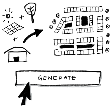
The business goals were to transform the existing workflow to be data-driven, flexible, and efficient.
PRIMARY RESEARCH
When the designer becomes the client

As I formerly worked as an architectural designer for the startup, I experienced being the target user myself.
Consequently, I had to be aware of my own assumptions and keep in mind that what I had experienced was not necessarily true to other designers.
I challenged these assumptions by gathering the opinions of a mix of users to create a more impartial picture. I interviewed the start up's designers, CEO and business leads, as well as external designers to prevent familiarity bias and to find out more about their daily tasks and pain points.
KEY INSIGHTS
Designers' technical abilities varied by a lot
Architects at the startup felt the technical ability of the local architects where the projects were situated did not match theirs and the software they'd use would often be different.
The houses had unique parameters that would dictate the orientation of the masterplan
The fixed orientation towards the sun and small number of types of houses simplify the parameters needed in the masterplan design.
Designers hopped between a number of software
Designers would use multiple software to get their designs from concept to presentation ready. They often suffered from lagging computers and expensive software costs.
Even though more efficient programs were available, designers took comfort in programs they were already familiar with
100% of participants continue to use software they used in university, even if they were aware of other programs that could automate their work.
COMPETITIVE ANALYSIS
Dissecting the designers' toolkit
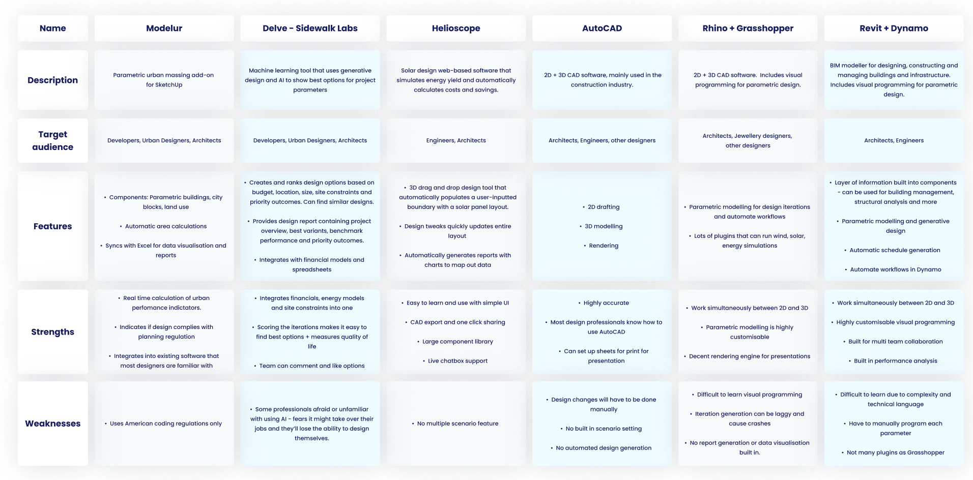
Analysing the software mentioned by interviewees provided great contextual insight into the manual, repetitive tasks the designers had to carry out every time there was a design change. I also researched direct competitors to see current possibilities in automated design, which validated the technical possibility of our ideas.
01
Complex
There are existing visual programming tools in the market that can automate some design tasks, but they are perceived to be too complex to learn and there isn't a lot of easy-to-comprehend documentation online to help designers.
02
Exclusive
Some of the software with automatic generation capabilities are exclusive and not easily available for designers to learn and use - would have to purchase before trying.
03
Overwhelming UIs
A user interface that presents all the tools available can be useful for an advanced user, but visually overwhelming for a new user. This can be a big stumbling block for designers who lack confidence in their technical skills.
DEFINE
The fulfilling ups and mundane downs
With a better understanding of the sentiment towards masterplan development, the project scope began to take shape. Based on the interviews and research, I formed a user persona as a way to steer the design to meet their specific needs.
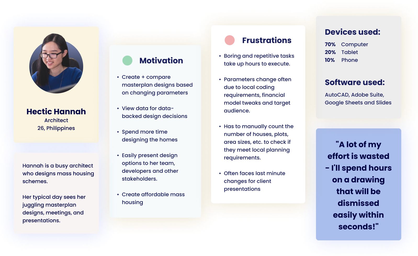
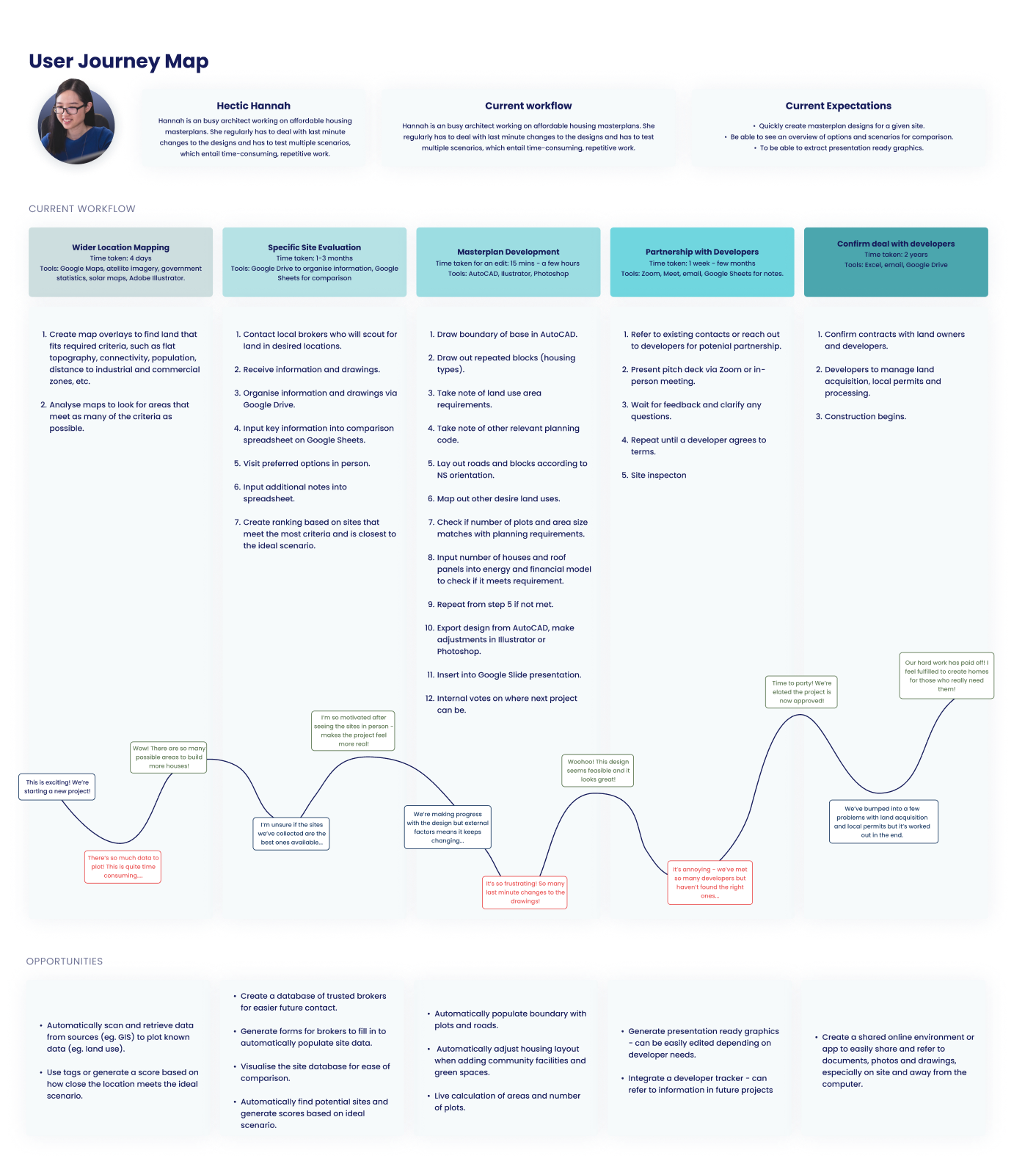
I drew up the existing workflow of the designers to find stumbling blocks that made the design process inefficient. I sat down with the startup's designers to create a user journey map to visualise the existing flow alongside the users' emotions. From here, I could uncover the key pain points and find opportunities that the software could address.
PROBLEM STATEMENT
Hectic Hannah is a busy urban designer who needs a way to quickly create and compare masterplan options for housing schemes because they want to spend more time designing and current methods can be time consuming and repetitive to create options manually.

IDEATE
Deconstructing change in the design process
After diving into the designer's workflow, there was a common factor among their various pain points: change. When partnering with different developers or working in different countries, the planning and financial constraints will be different for each project scenario. Unfortunately, changing these parameters mean changing the masterplan design, which takes up time and effort.
Instead of preventing changes from happening, the team accepted it was inevitable and we approached the design by choosing to embrace the change.
Instead of preventing changes from happening, the team accepted it was inevitable and we approached the design by choosing to embrace the change.
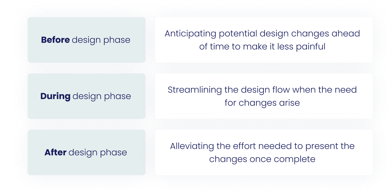
How might we prevent last minute tweaks to the masterplan design?
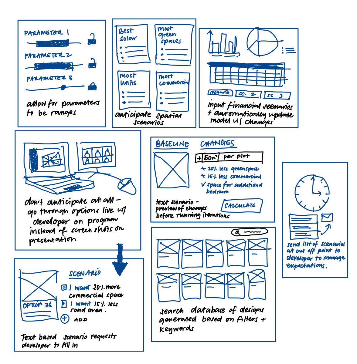
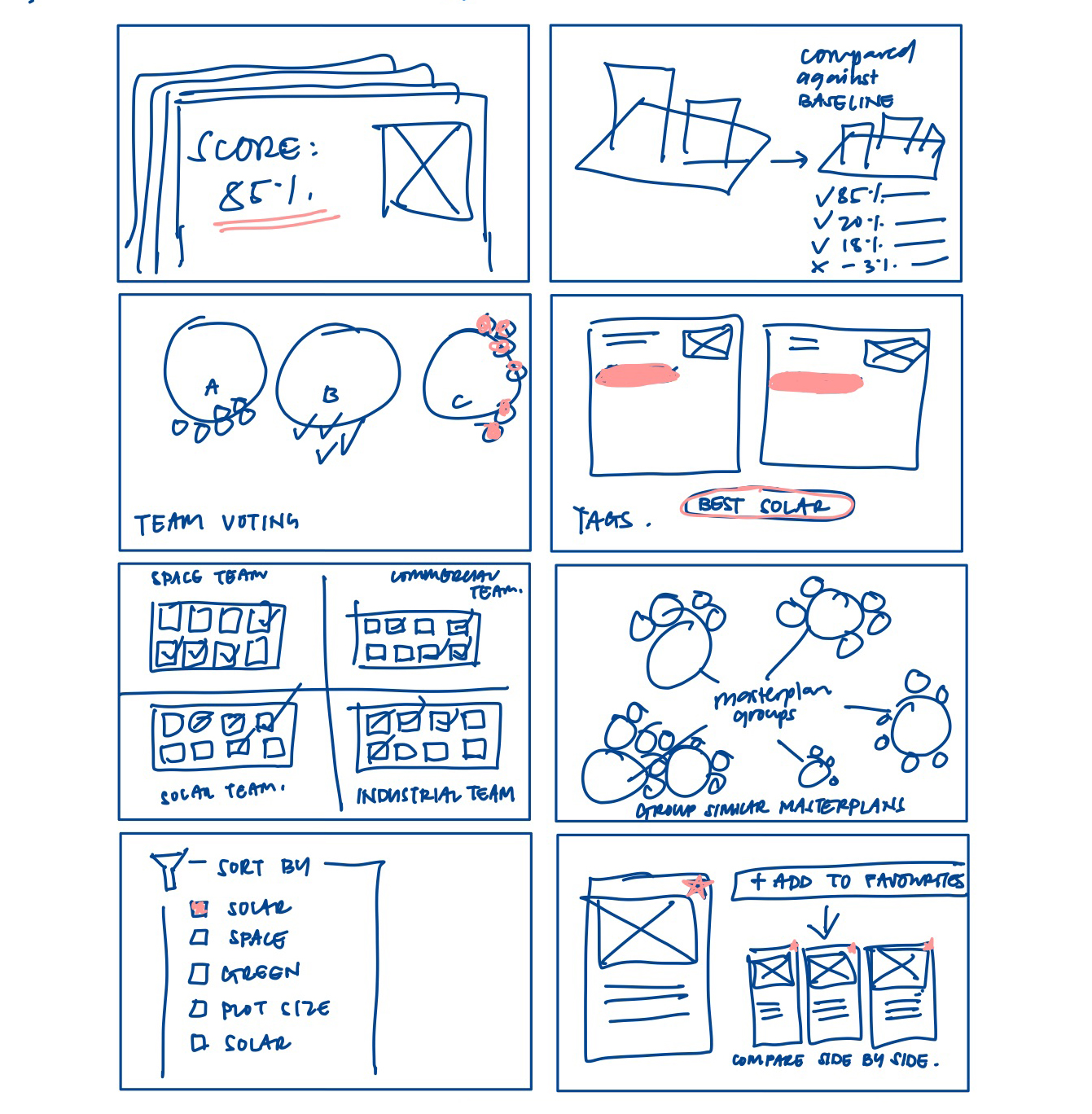
How might we quickly find the most optimal design option?
How might we make the design options presentation ready?
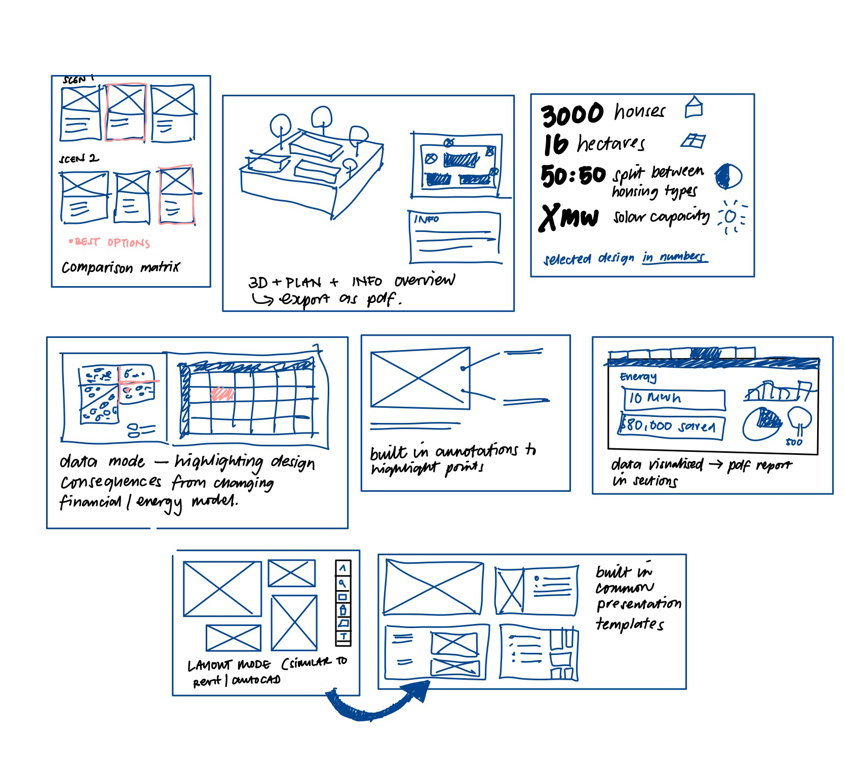
FEATURE PRIORITISATION
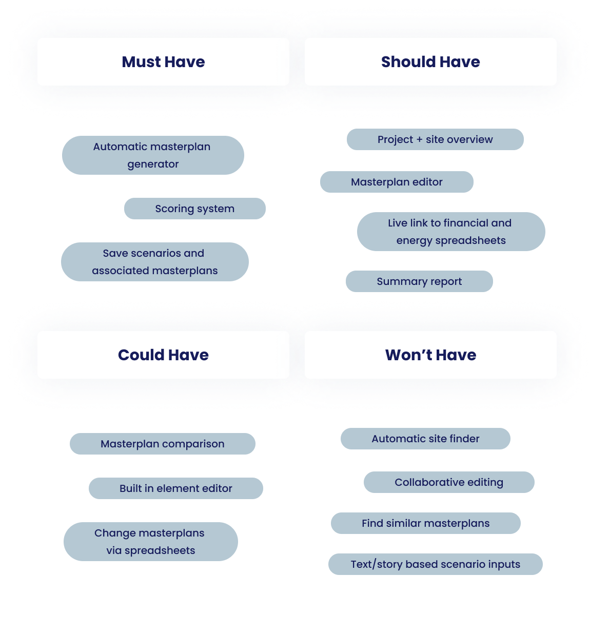
Determining the MVP
I used the MoSCow method with 2 startup team members to prioritise the main features included in the software.
USABILITY TESTING
Jumping into a mid-fi prototype
As I had a small timeframe to complete the prototype, I jumped into a mid-fi prototype usability study in order to gather detailed feedback from the users.
AN UNEXPECTED RESULT
Initial enthusiasm turned into hesitation
The key feedback I got however was despite the enthusiasm from the designers at the beginning, when asked if they felt if they would actually use the program for the next community project, 40% expressed they’d rather stick to their current methods.
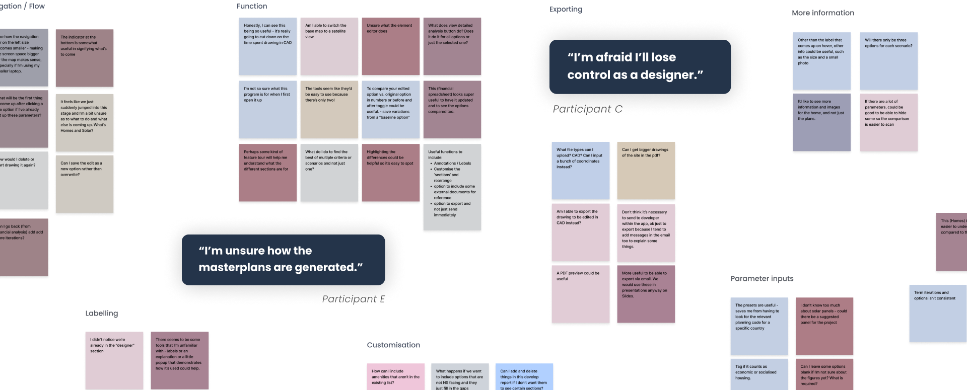
So how could we gain trust from the designers and increase their confidence in using the tool? I implemented the following:
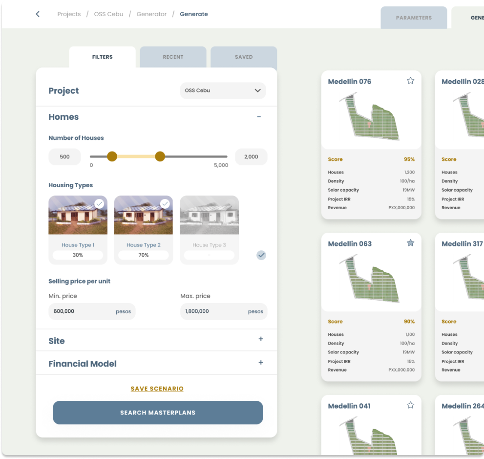
Increasing control over results
Incorporating sliders and input boxes within easy reach in the results page to encourage exploration.
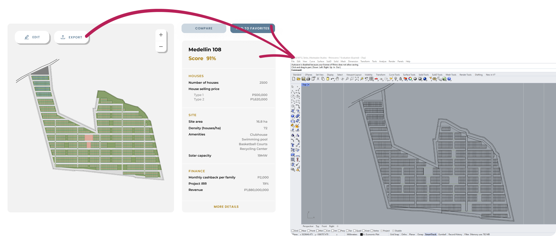
Exporting to familiar applications
Allowing designers to export drawings, reports and sheets so they can continue to edit in programs they’re comfortable with to ease the transition.
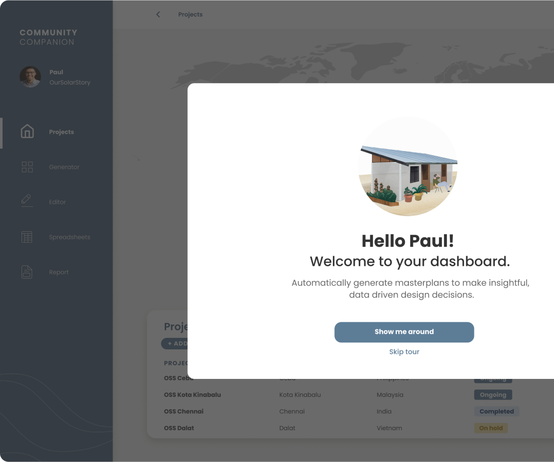
Tour onboarding
Features tour during onboarding to introduce the capabilities of the software.
Tooltips on hover
Provide contextual help through informative tooltips with videos to illustrate how to use tools.
FINAL DESIGN
The Solution - Community Companion
Project Overview
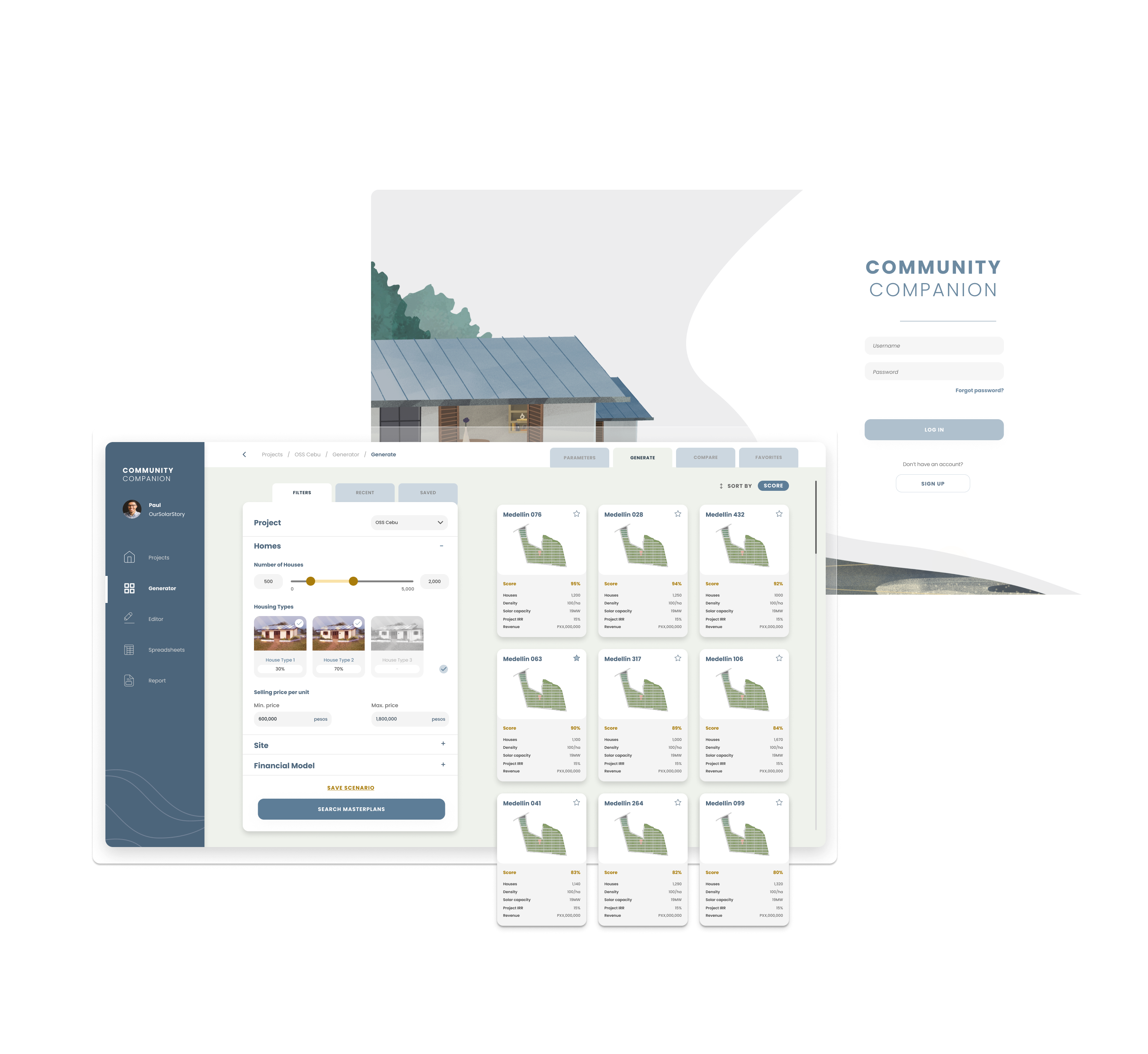
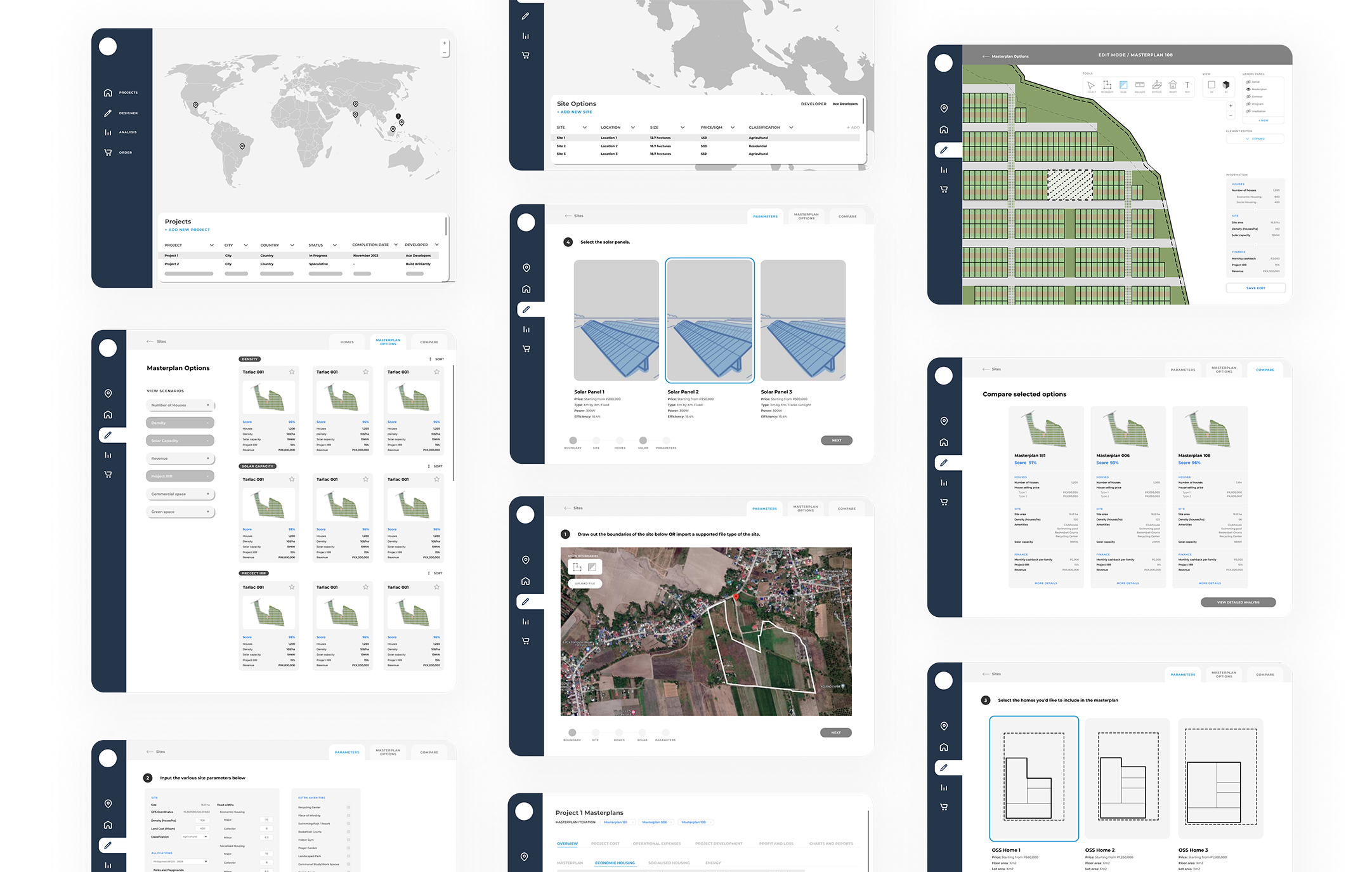
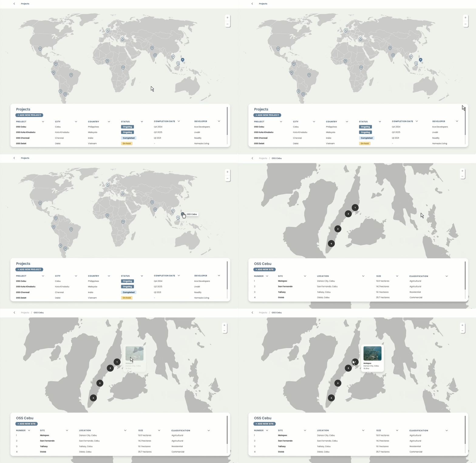
A summary of all the housing communities is displayed in map and list view, each containing data on potential land options.
Masterplan Generator
Based on user inputted parameters, masterplans are generated at a click of a button and are assigned a score based on how well they fit the user's parameters.
Masterplan Editor
Masterplans can be fine tuned and all data (such as number of houses, revenue, energy production) are updated in parallel to the changes.
Financial and Energy Analysis
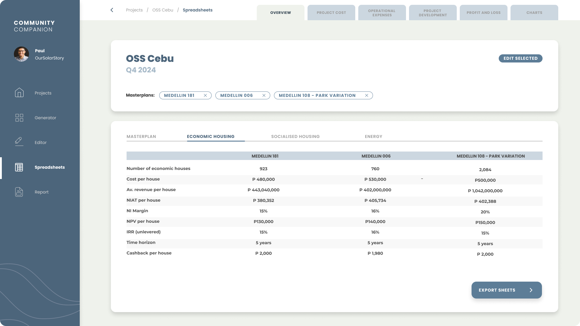
The financial and energy models are calculated for each masterplan, to help designers and developers make decisions.
Developer Report
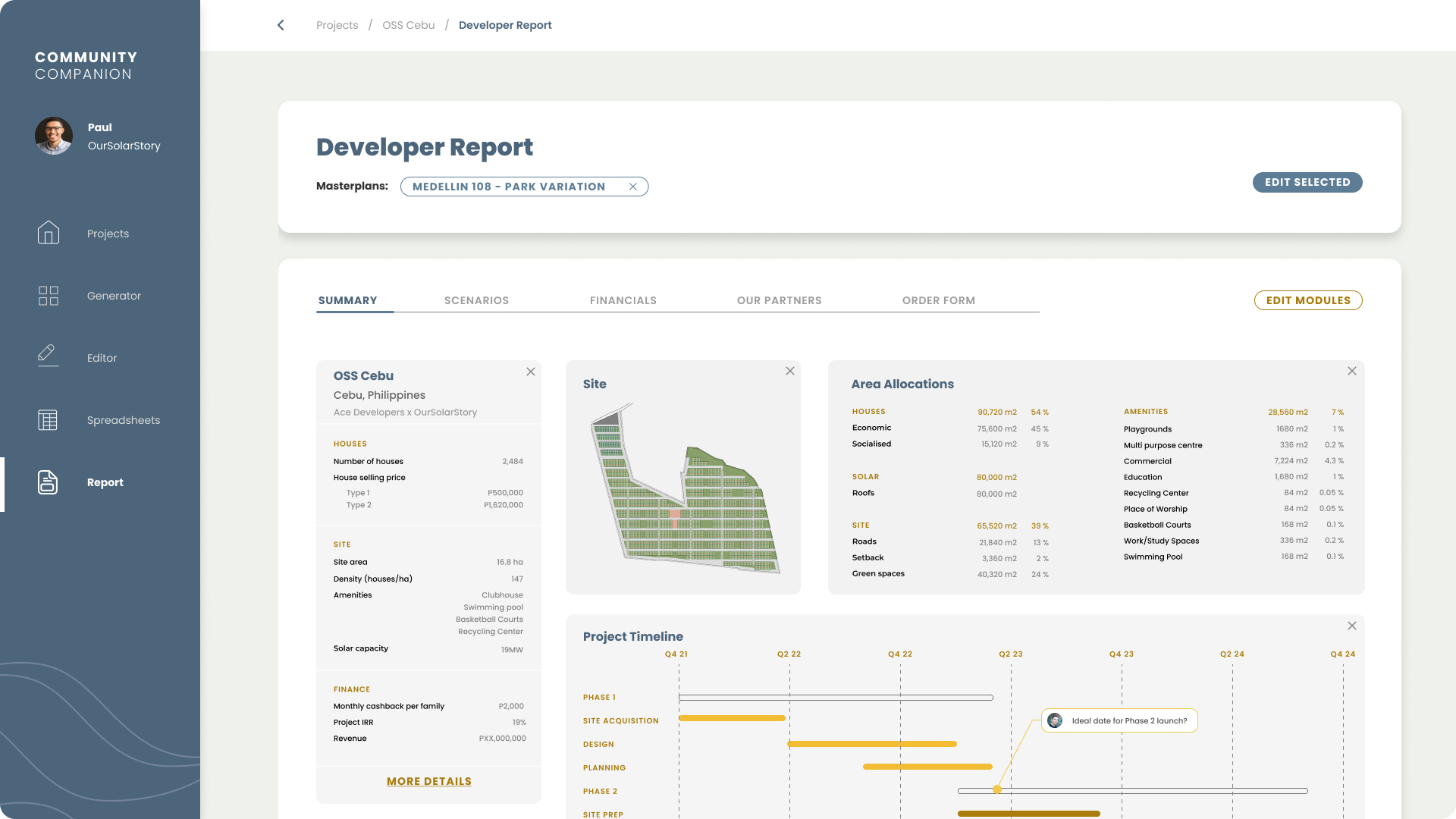
A summary of the selected masterplans is compiled into a customisable visual report to cut down time spent on making presentations for meetings.
INFORMATION ARCHITECTURE
Simplifying a complex workflow
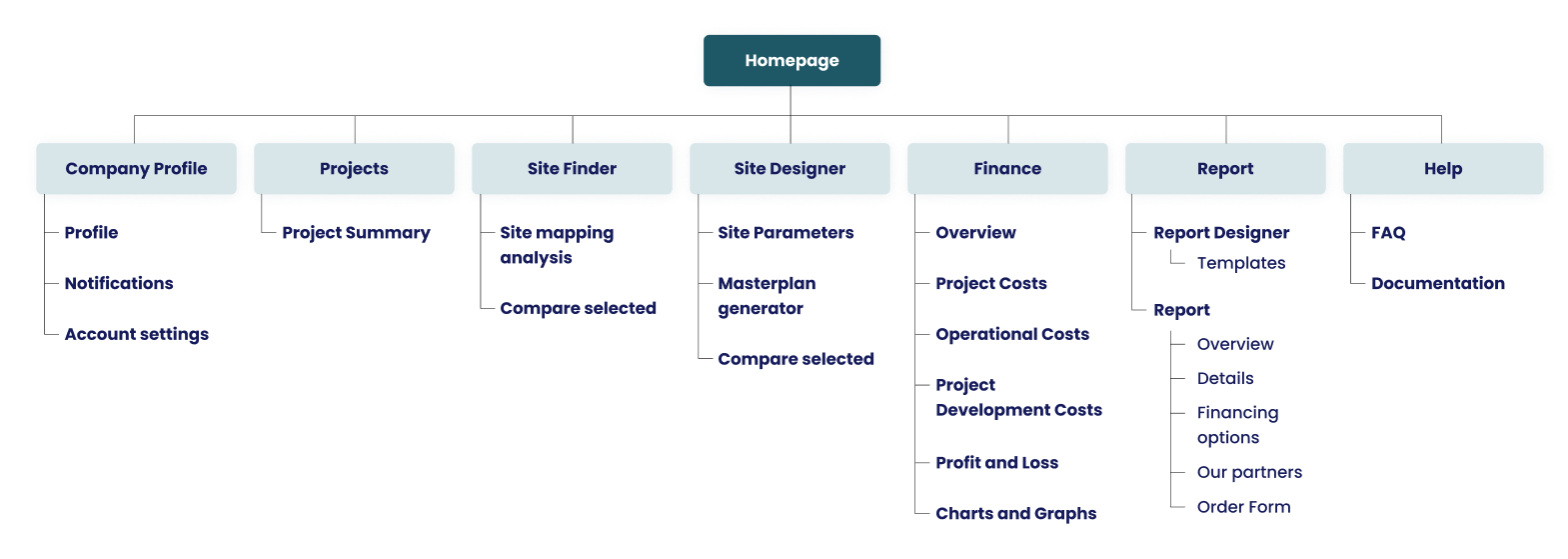
The navigation was structured around the steps of the designers workflow that was mapped in the customer journey map. It took me a few attempts to get this correct as I found in testing that the designers sometimes found it difficult to navigate the software. In hindsight, I should have conducted a card sorting exercise for a more focused insight into where the designers expected to find tools and features.
DELIGHT IN THE DETAILS
Illustrating the end goal
Animated illustrations of the startup's mission to create truly affordable homes to improve the lives of those who could not previously find a decent shelter to live in.
Reducing the perceived wait time
Rather than refreshing the entire page, sliders create live updates to the masterplan options to encourage exploration. However, this can take a bit of time to load, so I used skeleton screens and motion to decrease the perceived wait time and allow for progressive loading.
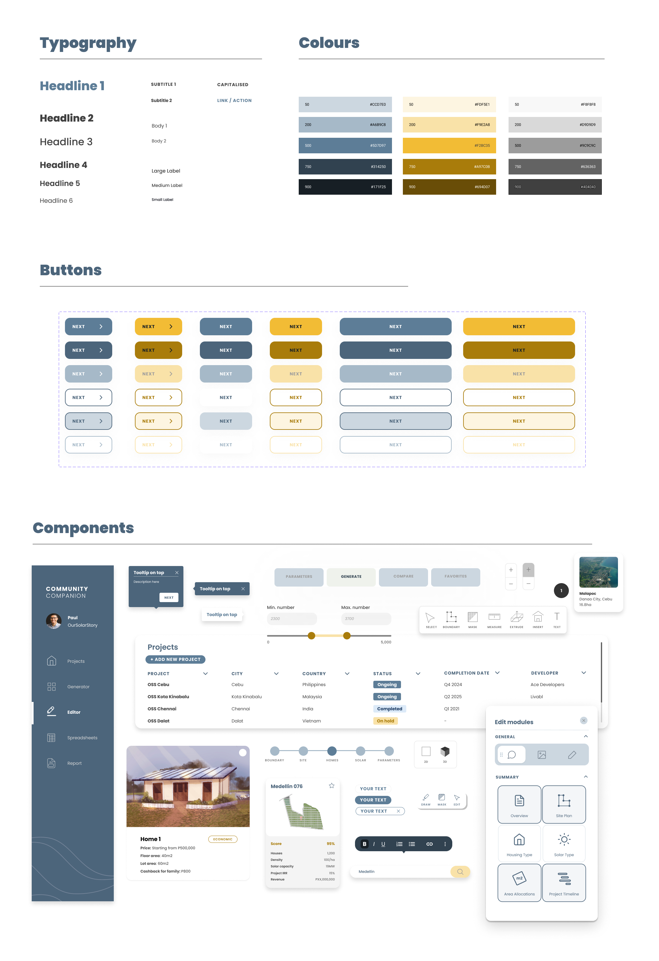
Crafting a design system
The startup wanted to convey a friendly-yet-professional feel to the software, so we used a rounded sans-serif font and a slightly rounded corner radius for the components.
Blue is the dominant colour, which reflects the brand colour, and yellow is used as an accent colour for elements that need to stand out.
Blue is the dominant colour, which reflects the brand colour, and yellow is used as an accent colour for elements that need to stand out.
REVIEW
The impact of Community Companion
I ran through the usability test again with the same participants and same tasks, but required the users to complete a more thorough survey afterwards to give their overall thoughts on the software and whether it had met our business goals.
01
100% agreed that Community Companion was easier to use compared to visual programming in Rhino and Revit.
02
75% of the designers were happy to use the software to replace their existing masterplan workflow.
03
The tool was presented to the board of investors and development for the tool will kick off in late 2022.
Did Community Companion meet business goals?
Was Community Companion....
... data driven?

80% of the designers found that assigning scores to the masterplan helps their decision making.
... flexible?
- All the participants rated the ability to save different scenarios as 'useful' or 'extremely' useful.
- Some questioned if the scoring system would work when a scenario required new parameters or alternative priorities.
- Some questioned if the scoring system would work when a scenario required new parameters or alternative priorities.
... data driven?
- As the tool only reached prototype stage, I wasn't able to get figures on how much quicker the software would be compared to current workflows.
- However, all participants perceived that the software would decrease time spent on:
- However, all participants perceived that the software would decrease time spent on:
- Checking if design meets planning regulations
- Calculating areas and number of plots
- Creating multiple design options
- Editing the graphs and data sheets to be presentation ready
REVIEW
Lessons learned
Involving the users helps build trust and enthusiasm
The team was very invested and happy to suggest improvements with each iteration because the project had the real potential to improve their work lives.
Simplifying a complex workflow isn't simple, but it's a satisfying challenge
It was difficult trying to simplify a non-linear process into simple forms and sliders, but collaborating with the designers and getting them to break down step-by-step their tasks helped a lot to see where we could make things more efficient.
REVIEW
Future steps
Clarity in the masterplan score calculation
The score calculation is determined by a weighted decision matrix. The parameters that determine the masterplan score could be assigned different priority ‘weights’ for different scenarios. What happens when there are 2 or more parameters of equal importance? How could the user change the weighted numbers?
A usability study should be run to determine how much information needs to be shown and how much control should be given to the user.
A usability study should be run to determine how much information needs to be shown and how much control should be given to the user.
Involve developers
As the deliverable for this task was just a prototype to show the vision of tool to the board of investors, the start up chose not to involve a developer yet.
Ideally, we should have involved developers from the beginning to see what's technically possible. We need them to validate if our ideas are feasible within the startup's budget. It is crucial to work with them for the next round of design.
Ideally, we should have involved developers from the beginning to see what's technically possible. We need them to validate if our ideas are feasible within the startup's budget. It is crucial to work with them for the next round of design.


