EatTogether
MOBILE
Delivering personalised recommendations to discover, save and vote on restaurants in Singapore, removing decision paralysis when eating out in groups.

OverviewProject DetailsProblemSolutionEmpathiseContextPrimary ResearchCompetitive AnalysisKey InsightsDefineUser Personas + Journey MapsProblem StatementIdeateGuiding PrinciplesCrazy EightsTesting Design ConceptsPrototype + TestImprovements from TestingFinal OutcomePrototypeDesign SystemImpactLearning + Next Steps
TIMELINE
May - June 2021 (2 months)
SCOPE OF WORK
User research, wire framing, prototype, user testing, illustration
TEAM
1 x UX/UI Designer (me) - part of Google UX Course
PROBLEM
Groups in Singapore suffer from decision paralysis
when finding a place to eat at.
There are over 13,000 F&B establishments to eat at on a tiny island that takes only an hour to drive from one side to another. The vase amount of food options within the tiny island of Singapore means groups are spoilt for choice. However, too much choice can end up in indecision!
SOLUTION
EatTogether provides personalised suggestions of where to eat based on the group's preferences.
Curated recommendations
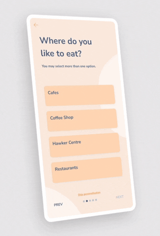
- Users input their preferred cuisines and dishes.
- EatTogether compiles the data for your group and recommends 3 idea places based on collective preferences.
- Less choices means less decision paralysis!
- EatTogether compiles the data for your group and recommends 3 idea places based on collective preferences.
- Less choices means less decision paralysis!
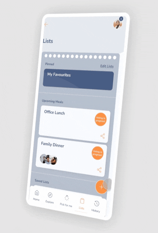
Collaborative Lists
- Create a collaborative list to add and share your options with your group!

Voting and Booking
- Your group can anonymously vote for the restaurant of their choice.
- Once voting is complete, the app directs the host to book a table at the restaurant.
- Once voting is complete, the app directs the host to book a table at the restaurant.
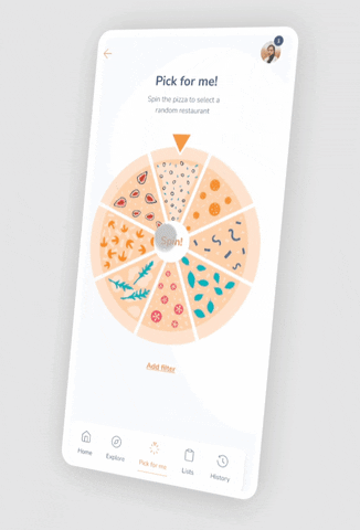
Pick for Me
- Still can't decide where to go? EatTogether features a spinning pizza wheel to pick one restaurant for your group.
CONTEXTUALISING THE PROBLEM
The land of foodies with too many choices...
During my stay in Singapore, I noticed my peers were frustrated when deciding where to eat. I had experienced it myself - my boyfriend was frequently annoyed at how I would go back and forth with my options for where to grab dinner! To say Singaporeans love food is an understatement, but when eating out together, it seemed like picking a suitable restaurant was a sometimes daily struggle. Why is that? My hypothesis was:
This is some text inside of a div block.

This is some text inside of a div block.
Singapore is a small, dense island that is only roughly half the size of London.

This is some text inside of a div block.
There are 13,000 F+B establishments packed into the island (CNA, 2021), serving the 1 in 4 Singaporeans who dine out daily (Nielsen, 2018).

This is some text inside of a div block.
Busy students and professionals often face decision paralysis due to the abundance of choices nearby.
PRIMARY RESEARCH - INTERVIEWS AND SURVEYS
"It can be a unnecessarily long and messy process..."
I wanted to validate my hypothesis that groups found it difficult to find a suitable place to eat, hence I designed a survey which received 32 responses and held 5 remote interviews with students and young professionals aged 18-35 about their dining habits.

COMPETITIVE ANALYSIS
The competition only amplified the vast number of choices and offered little to no options to facilitate group decisions.
The interviewees mentioned that they used a few apps to browse for suitable F&B spots. I conducted a competitive analysis of those apps, as well as those that were popular on the App Store in Singapore. The direct competitors were booking apps that filtered through the restaurants based on location and cuisine type. There were also popular indirect competitors (food delivery apps) which were better in terms of UX/UI and offered a wider range of restaurants to pick from.

All were great at showing me a diverse range of options, but they showed too many! There was a lot of unnecessary noise to scroll through and too many steps to take to find a place that would work for a group in a quick amount of time.

Overall, I found that the competition tended to give too many restaurant suggestions that were not always suitable or available. They had little to no aspect of personalised suggestions for food preferences, especially for an entire group. The apps offered no streamlined option and users would still have to jump between the food apps and separate chat apps to decide on a place to go.
KEY INSIGHTS AND THEMES
Theme 1: Time
Nearly 60% of respondents spent more than 15 minutes in deciding where to eat.
‘Planners’ spend a lot of time jumping between chat apps and food articles, maps and reviews to decide and coordinate where to go.
‘Non-planners’ waste time walking around in the heat/rain to find places with available tables/short queues + good food.
Theme 2: Selection
62.5% found difficulties in finding eateries that suit everyone’s dietary requirements.
82% of those who planned ahead found it tedious to look through websites to check menus for food options.
Those who weren’t the ‘deciders’ of the group felt the choice often resulted in overpriced or low quality food selections.
USER PERSONAS
Who is involved in choosing where to eat?
I realised during the Empathise stage that the product could be catered for two types of people: those who plan meals ahead of time with their group, and those who just leave the decision for when meal time approaches.

For this project, I decided to concentrate on Peter the Planner as those groups that plan ahead were more likely to turn to app for planning meals. I made the assumption that a busy office worker would be less likely to use an app and would be ok with settling for any F&B spot nearby their office for the sake of convenience and time.
USER JOURNEYS
Discovering the need for a consensus
Within groups who plan ahead, it wasn't enough to only consider Peter, who'd take on the 'leader' role, but to evaluate the rest of typical personalities in a group.

If we dive into the emotions and thoughts through the journey of a group deciding on a restaurant, we find a key spot where all 3 types of personalities in a group are unhappy - the moment just before and after the decision.

PROBLEM STATEMENT
Young and busy groups in Singapore need a way to quickly find and decide on a suitable restaurant because they feel frustrated due to time wasted on researching and coming to a consensus.
IDEATION
Guiding design principles

With these principles considered, I conducted a Crazy Eights exercise, based on two key flows I had identified based on the users' needs.
CRAZY EIGHTS
Flow 1: Users input their food preferences
.png)
Flow 2: Select a restaurant from the suggestions
.png)
INTITAL IDEAS
Exploring four quick design concepts
Some of the ideas from the Crazy Eights exercise were explored further through lo-fi prototypes, which I presented to my interviewees to gain more feedback and generate more ideas as to what they would want from an app.
Idea 1: MRT Kiosk
En route to meeting up, users input what they'd like to eat. Group is given a QR code which they scan at an MRT kiosk when meeting up, which reveals the selected restaurant.


Idea 2: Claw machine
Members select 3 restaurants each from a suggested list, add option to a claw machine + play it to select one restaurant.
Idea 3: Tinder-style matching
Users swipe right or left on food and cuisines they'd like to try for their meals and app suggests restaurants based on collective preferences.


Idea 4: Shared Lists
The group creates shared lists that calculates the preferences of every member of the list. The app suggests 3 restaurants and users can anonymously vote on their favourite. Lists can double up as bookmarks for future meals.
I proceeded with the Shared Lists idea as lists were quite functionally versatile and simple to develop, and did not require users to input their preferences for every meal, just once at the beginning.
PROTOTYPES AND TESTING
Key improvements from user testing
60% of users were unsure what collaborative lists were for initially.
It became clear that there needed to be better explanations for how the collaborative lists took into account every group members' preferences. I did this through:
- New introductory screens during onboarding
- Pop-up modal when adding people to a list for the first time.


Users sought for different 'levels' of choice available to them.
Some users asked what would happen if they still couldn't decide between three options. Drawing inspiration from an earlier crazy eights concept, I:
- Added the Pick for Me feature, which provides only 1 option
- This feature would fulfill the needs of our other target audience (the groups who didn't plan ahead)
40% wanted to input specific dishes instead of broader cuisines for better F+B matches.
The onboarding process was received well, but there were suggestions on how it could be better. I implemented the following:
- Introduced the Tinder-style input from Concept Testing into the onboarding.
- Added more detailed onboarding questions like dietary requirements and types of eateries users enjoyed.

The
solution
FINAL OUTCOME
Final prototype
Design system

Colour
Orange is a fresh colour that is meant to stimulate our appetites (common colour in fast food!).
It is warm, casual and exciting and sets the tone of the app for friends to come together and share a meal.
Blue is a complementary colour used as an accent colour in CTAs and other elements.
It is warm, casual and exciting and sets the tone of the app for friends to come together and share a meal.
Blue is a complementary colour used as an accent colour in CTAs and other elements.
Cards
Cards are a great way to organise information coming in from different sources (restaurants) in a consistent manner.
Avatars let users know who's in the shared list at a glance.
Frequent actions like Favourite and Add to List are easily accessible.
The cards are a snapshot of key information to help users quickly decide on a restaurant.
Avatars let users know who's in the shared list at a glance.
Frequent actions like Favourite and Add to List are easily accessible.
The cards are a snapshot of key information to help users quickly decide on a restaurant.


Applying Hick's Law
Providing fewer choices reduces the time taken to make a decision.
Less cards = more ‘breathing room’ to show relevant information to help users decide at a glance.
Although only 3 choices are provided, by leveraging on data from user’s searches, preferred dishes, cuisines and type of F+B, the app will provide better personalised recommendations over time.
Less cards = more ‘breathing room’ to show relevant information to help users decide at a glance.
Although only 3 choices are provided, by leveraging on data from user’s searches, preferred dishes, cuisines and type of F+B, the app will provide better personalised recommendations over time.
REVIEW
“Everything I need to do with restaurants is now all in this one app.”
With the high fidelity prototype, I conducted a further round of usability testing in a similar format to the lo-fi prototype usability test. I founded that:
01
4 out of 5 users felt that EatTogether would be useful in helping groups decide where to eat.
02
All users felt that the interface was easy to use and understand.
03
All users successfully completed the 5 core tasks of the app without the need for help.

If the app was developed, we could measure its success through KPIs such as task success rate, time on task, user retention rates, NPS and if the Lists are used by groups or just the 'decider' of the group.
Learnings
There are plenty of opportunities resolving simple tasks.
The project was a great example in illustrating how a seemingly simple daily task can evolve to be very complex when broken down. Each pain point within the user journey can spark an opportunity for design to alleviate.
Trust in the process
This was my first in-depth UX project, so my learning curve was very steep throughout the duration of this project. The Design Thinking Project provided an orderly and logical process to solve design problems.
Future steps
Consider other edge cases
If there was more time, I would conduct research to see what users would like to happen if there is a tie in voting. Moreover, what happens if there are no suitable places for the combination of people in the group (eg. no vegan options nearby)?
Make EatTogether more accessible
There are 4 national languages in Singapore, so it would be ideal to see how the design would be tweaked in other languages. Moreover, I should have dived into WCAG compliance earlier on in the process to check touch targets, placement, text sizes and colours.